Framedless Glass Glazing & construction 2026
Turning one glass company into eight reasons to call
A Sydney glazier was hiding eight distinct services inside a single page. We gave each one its own page, its own photography and its own argument — and built the site around the thing customers actually buy on: how it looks.
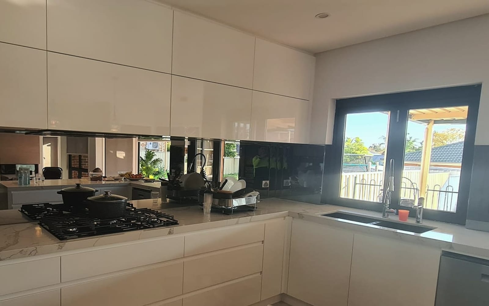
Results
- one per service, each findable on its own
- 8 pages one per service, each findable on its own framedlessglass.com.au/services/
- up from one page trying to do all of it
- 15 pages up from one page trying to do all of it Live site
- accessibility barriers in independent testing
- Zero accessibility barriers in independent testing axe-core, WCAG 2.1 AA, tested at phone and desktop widths
The problem
Framedless Glass installs eight genuinely different things: shower screens, balustrades, splashbacks, mirrors, skylights, double glazing, specialist glass and repairs. On the old site they were eight bullet points on one page. That is a problem twice over. A customer searching for a glass balustrade found a page mostly about shower screens and assumed they were in the wrong place. And a business that installs beautiful things was describing them in words instead of showing them.
Our approach
We treated each service as its own small business with its own customer. The person replacing a cracked splashback and the builder specifying balustrades for a townhouse development want different information, at different prices, with different worries. Each deserves a page written for them. Then we made the whole site look the way the product looks — clean, bright, precise — because in this trade the buying decision is overwhelmingly visual.
What we built
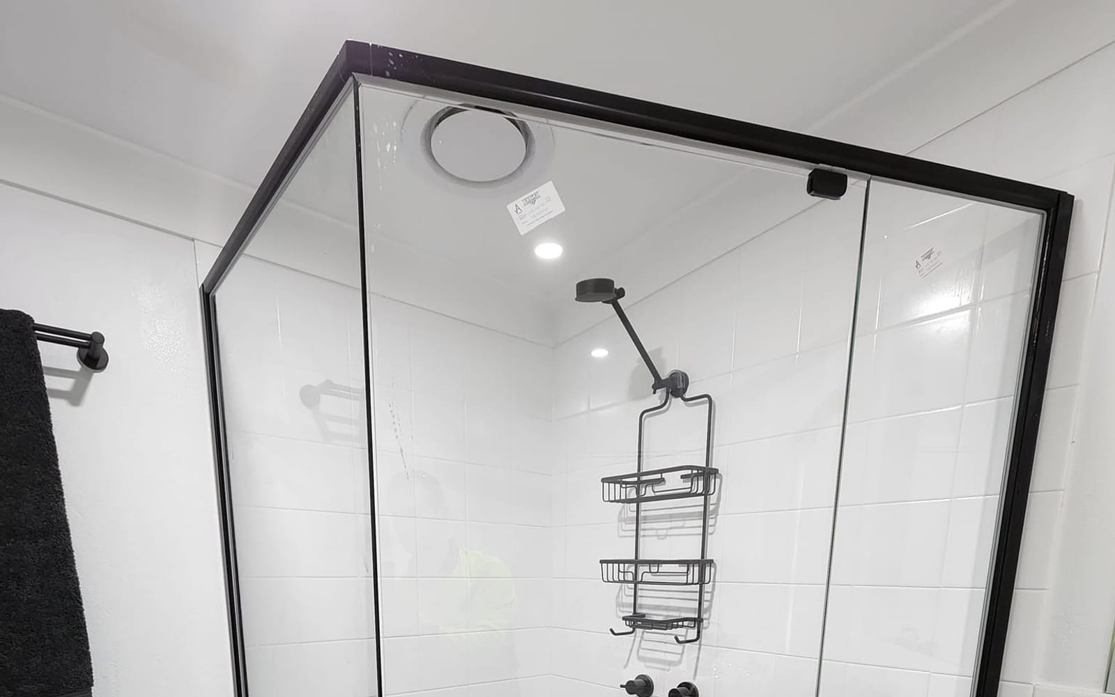
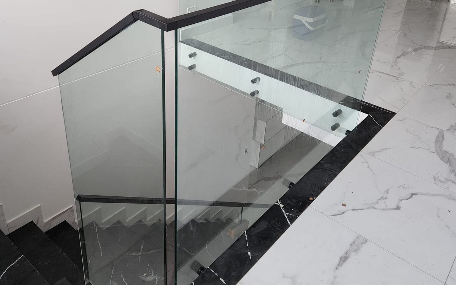
Fifteen pages, eight of them dedicated service pages, each with real installation photography and answers to the questions that specific customer asks. A gallery that shows every job at its true proportions rather than cropping everything into a tidy grid. Brand colours taken directly from the company's existing logo rather than invented alongside it. And a quote request that stays within reach on every service page.
One page cannot sell eight things
This is the most common and most expensive structural mistake we see on installer and trades sites.
“Frameless shower screen cost”, “glass balustrade installation Sydney” and “splashback replacement” are three different people. Different budgets, different urgency, different questions. A single page listing all eight services can be relevant to all of them and convincing to none.
It also fails the moment someone lands on it. A builder looking for balustrades sees a page mostly about bathrooms, decides this isn’t a balustrade company, and leaves. That visit cost real money to acquire and produced nothing.
Eight pages is more work up front. It is also the only structure that can win eight different customers.
There is a second, newer reason it matters. When someone asks an AI assistant “who installs frameless shower screens in Sydney”, it doesn’t read whole websites — it pulls the most relevant passage it can find. A page entirely about shower screens is a far better candidate than a sentence buried inside a page about eight unrelated products.
In this trade, people buy with their eyes
Nobody chooses a glazier from a description. They choose from a photograph of a bathroom that looks like the one they want.
So the design gets out of the way of the photography.
The palette came from the logo, not from us. The existing mark has a gradient running from green through teal to deep blue. We sampled it and built the whole site from those colours rather than inventing a new scheme beside it. The gradient itself reappears as a fine rule under the header and behind service pages that don’t yet have photography, so those pages still feel finished.
The gallery doesn’t crop anything. Installation photos arrive in every shape imaginable — a tall shower screen, a wide balustrade run. Most galleries force them into identical squares, which throws away exactly the detail a customer is scrolling for. Here every photo keeps its true proportions, laid out like a magazine spread. Tap one and it opens full-screen, with arrow keys to move between them.
Filters by service. A customer who came for splashbacks can see only splashbacks in one tap, rather than scrolling past forty bathrooms.
Every service page keeps the quote form in reach. The moment someone decides is unpredictable — it might be the third photo or the pricing paragraph. Making them navigate away to act is how enquiries are lost.
Built so nobody is locked out
The site was tested independently for accessibility at both phone and desktop widths and currently reports zero issues. That covers colour contrast, keyboard navigation, screen reader labelling and touch target sizes.
Two of the brand’s own gradient colours actually fail contrast requirements at normal text size — so the design system includes darker variants used specifically for text, while the originals stay for large graphic elements. That distinction is the difference between a palette that looks right in a mockup and one that survives real content.
Under the hood
For anyone technical who is curious.
The site is a statically built multi-page site. Shared elements — the header, the mega menu, the footer, the sticky quote card — live in one file each and are inserted at build time, so the finished pages contain the real navigation rather than assembling it in the browser. That matters because most AI crawlers do not run JavaScript, and a site built to be found should not hide its own navigation.
Total JavaScript across the whole site is 3.3 KB. The full-screen photo viewer uses the browser’s own dialog element, so focus handling and escape-to-close come from the platform rather than from a library — about a tenth the weight of a typical gallery plugin, and more accessible by default. Adding a new page means dropping in a file; the build picks it up automatically.
What we would do differently: auditing the live site for this case study turned up a real gap — only two of the seven images on the home page declare their dimensions, so the layout can shift slightly as they load. The gallery does it correctly; the home page was missed. It is a small fix and it is on the list. A case study with no mistakes in it is a brochure.
Related work
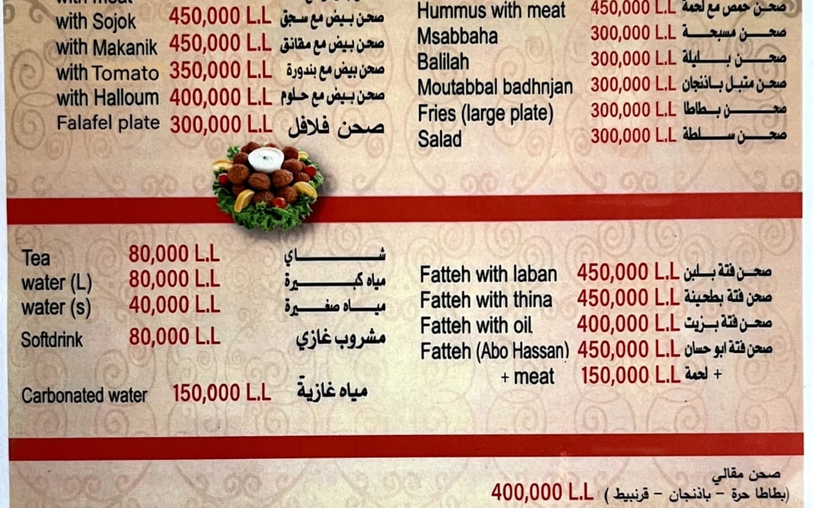
 Hospitality
 Abou Hassan · 2024
A restaurant page that answers the only three questions that matter
Where are you, when are you open, and what do you serve — answered in one scroll, with the food doing all the talking.
1 scroll from landing to menu, address and hours
Read the case study
 Trades & home services
 That Gutter Guy · 2026
Getting a Hunter Valley trades business found in every town it serves
A gutter, solar and roofing business was invisible outside its home town. We rebuilt the site around the places it actually works — and made it look like the most professional operator in the valley.
10 pages one per trade, plus every town served
Read the case studyHave a problem shaped like this one?
Thirty minutes is usually enough for us to tell you whether we can help.