Abou Hassan Hospitality 2024
A restaurant page that answers the only three questions that matter
Where are you, when are you open, and what do you serve — answered in one scroll, with the food doing all the talking.
Results
- from landing to menu, address and hours
- 1 scroll from landing to menu, address and hours abouhassan.net
- to load, even on a phone connection
- 0.32s to load, even on a phone connection Measured Aug 2026
- pop-ups, cookie banners or newsletter interrupts
- 0 pop-ups, cookie banners or newsletter interrupts Live site
The problem
Someone opens a restaurant's website on their phone. They are hungry, they are probably standing outside or sitting in a car, and they have about five seconds of patience. They want to know three things: where you are, whether you're open, and whether there's something here they want to eat. Most restaurant sites answer none of those quickly — they open with a full-screen video, hide the menu behind a PDF that won't zoom, and bury the address in the footer.
Our approach
Treat it as a single page, not a website. Everything in the order a hungry person needs it, nothing hidden behind a click, and no navigation to learn because there is nowhere else to go. Then let the food photography do the selling, because in a restaurant that is the only thing that ever sells anything.
What we built
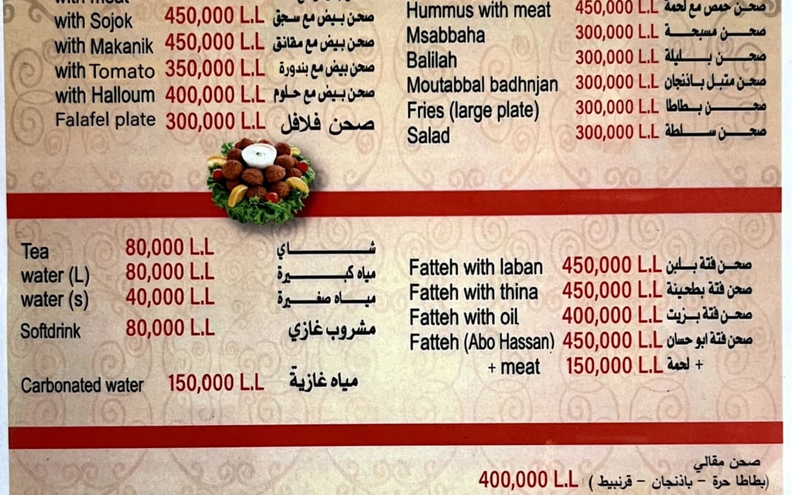
One page, scrolled top to bottom: the dishes, the story, the location. The menu is real text on the page rather than a PDF, so it can be zoomed, searched, copied into a message and translated by the phone automatically. The design draws on the restaurant's own visual identity — a hand-drawn wordmark and oriental motifs — used sparingly enough that the food stays the loudest thing on the screen.
The five-second test
Every restaurant website should be judged on one thing: how long it takes a hungry stranger on a phone to find the menu and the address.
Most fail it. The pattern is depressingly consistent — an autoplaying video of the dining room, a cookie banner over the top of it, a hamburger menu hiding six pages, and the actual menu as a PDF that opens at 20% zoom and cannot be read without pinching.
This site answers all three questions in a single scroll. There is no navigation because there is nowhere to navigate to. There is nothing to dismiss before you can read anything.
The menu is text, not a picture of text
This is a small decision with disproportionate consequences.
A PDF menu cannot be zoomed comfortably on a phone. It cannot be searched. It cannot be translated by the browser for a visitor who does not read English. It cannot be copied into a message to the friend you are meeting. And it is effectively invisible to search engines, which means the dishes you are known for never appear when someone searches for them.
Writing the menu as ordinary text on the page fixes all of that at once, and costs nothing.
Letting the food be the design
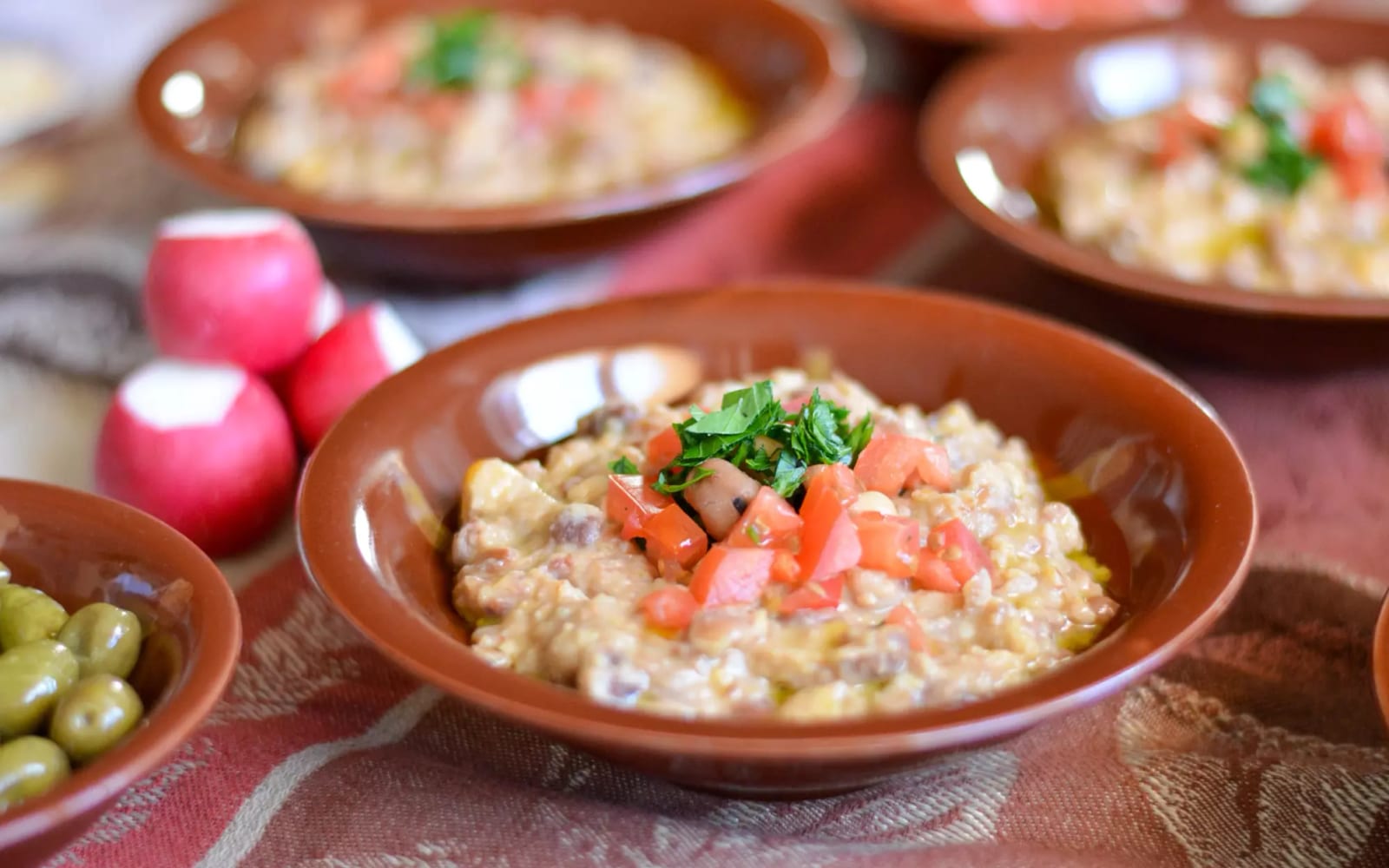
The strongest asset a restaurant has is a photograph of its food. Everything else on the page is framing.
So the layout is generous and quiet: a single typeface, wide margins, and long uninterrupted runs where a dish fills the screen. The restaurant’s own hand-drawn wordmark and oriental motifs appear at the edges — in section rules and the logo — as a signature rather than a theme. The temptation with a restaurant of this kind is to lean into pattern and ornament everywhere, which reliably makes the food look worse.
Under the hood
For anyone technical who is curious.
The whole site is 17 KB and ships zero JavaScript — not a reduced amount, none at all. That was not a target; it is what happened once we removed the things that existed for their own sake. Most script on a small business site powers a carousel nobody swipes, a modal that interrupts, or analytics nobody reads. Take those out and the JavaScript takes itself out.
The practical consequence is that the page is fully usable before it has finished loading, on any connection, on any phone, including the old one in someone’s pocket.
What we would do differently. This is the oldest project in the portfolio — started in 2022 — and one thing has genuinely dated. The site carries no structured data: no machine-readable opening hours, no location coordinates, no menu markup.
For a restaurant, that is now a real cost. Google Maps, local search and AI assistants lean heavily on exactly those fields when deciding which restaurant to recommend to someone searching nearby. A page can be perfect for a human being and still be close to invisible to the layer that increasingly does the recommending.
None of that made the site wrong in 2022. All of it is what we would fix today — and the fact that a fast, well-made site can still be badly served by search is precisely why our SEO and AI SEO work exists as its own service rather than as an afterthought.
Related work
 Glazing & construction
 Framedless Glass · 2026
Turning one glass company into eight reasons to call
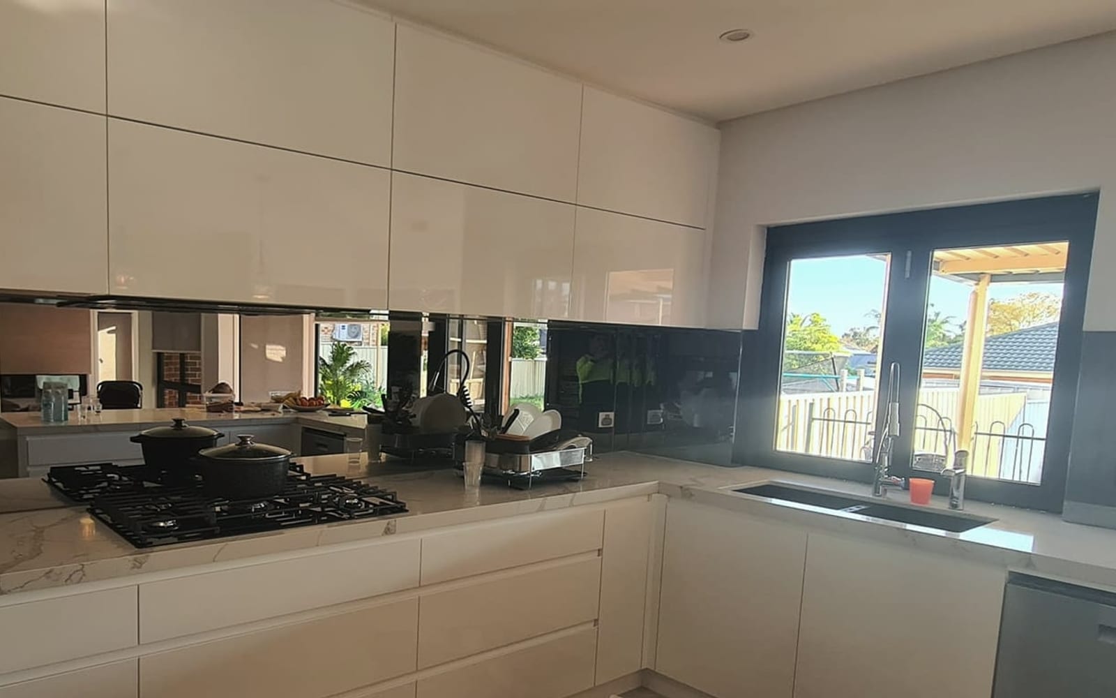
A Sydney glazier was hiding eight distinct services inside a single page. We gave each one its own page, its own photography and its own argument — and built the site around the thing customers actually buy on: how it looks.
8 pages one per service, each findable on its own
Read the case study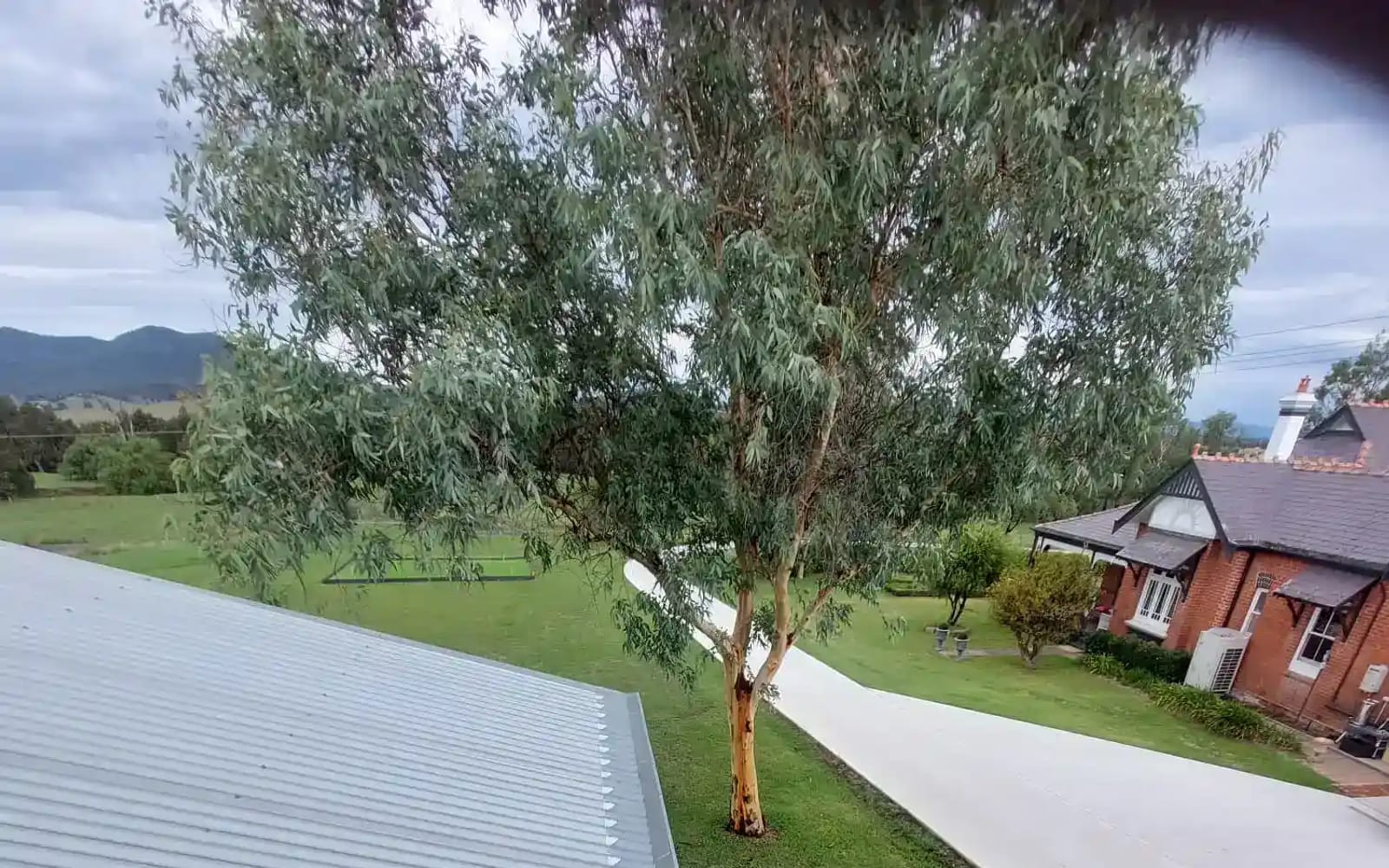
 Trades & home services
 That Gutter Guy · 2026
Getting a Hunter Valley trades business found in every town it serves
A gutter, solar and roofing business was invisible outside its home town. We rebuilt the site around the places it actually works — and made it look like the most professional operator in the valley.
10 pages one per trade, plus every town served
Read the case studyHave a problem shaped like this one?
Thirty minutes is usually enough for us to tell you whether we can help.